

Cumulative frequency diagrams are quite popular on GCSE mathematics papers. They can be fairly straightforward, although it’ll be useful to also practice box plots. The information is fairly similar … you can find the median, quartiles and ranges in both, with a typical question comparing information from both sources.
Q4 on these past paper questions might be useful to try. There isn’t a video, as it could be a little difficult to follow, although I hope the videos below will give you a head start – please make contact if you need any help 🙂
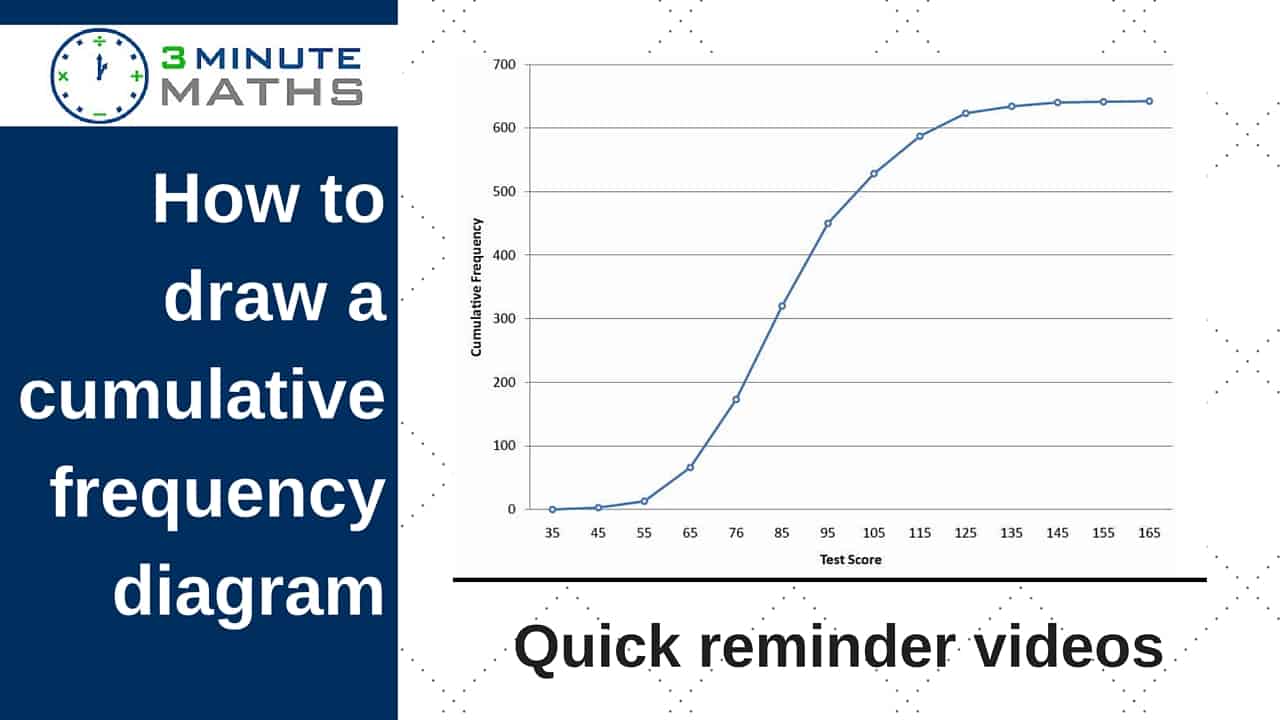
Top Tips!
● Make sure, when you add all the frequencies, the total is the same as the information given in the question
● You plot the highest value of each class width against the cumulative frequency value (examples on the videos)
● The cf axis is always the vertical (y axis)
● On the cf axis, 50% = the median, 25% = lower quartile, 75% = upper quartile
If you’d like to ask for any more detail, or you’re not sure about anything, please do ask a question in the comments section.
All best with your studies


Watch on YouTube
How to draw a cumulative frequency diagram – lorries GCSE question
How to draw a cumulative frequency diagram – teacher ages GCSE
[easyazon_image align=”none” height=”160″ identifier=”0748713891″ locale=”UK” src=”https://www.3minutemaths.co.uk/wp-content/uploads/2016/05/710M50SX46L.SL160.gif” tag=”matwra-21″ width=”127″]
[easyazon_image align=”none” height=”160″ identifier=”1841465453″ locale=”UK” src=”https://www.3minutemaths.co.uk/wp-content/uploads/2016/05/51RH7wHb8nL.SL160.jpg” tag=”matwra-21″ width=”113″]
[easyazon_image align=”none” height=”160″ identifier=”1841465364″ locale=”UK” src=”https://www.3minutemaths.co.uk/wp-content/uploads/2016/05/51qSWycadZL.SL160.jpg” tag=”matwra-21″ width=”113″]